Hey!
It took me a while to get another update out, but as I mentioned in previous post I really want to focus on the process and explain what goes through my head as I work on an environment. I want it to be rich in useful content and deep analysis rather than just posting bunch of renders. Ok, now we have this out of the way, let's get into it!
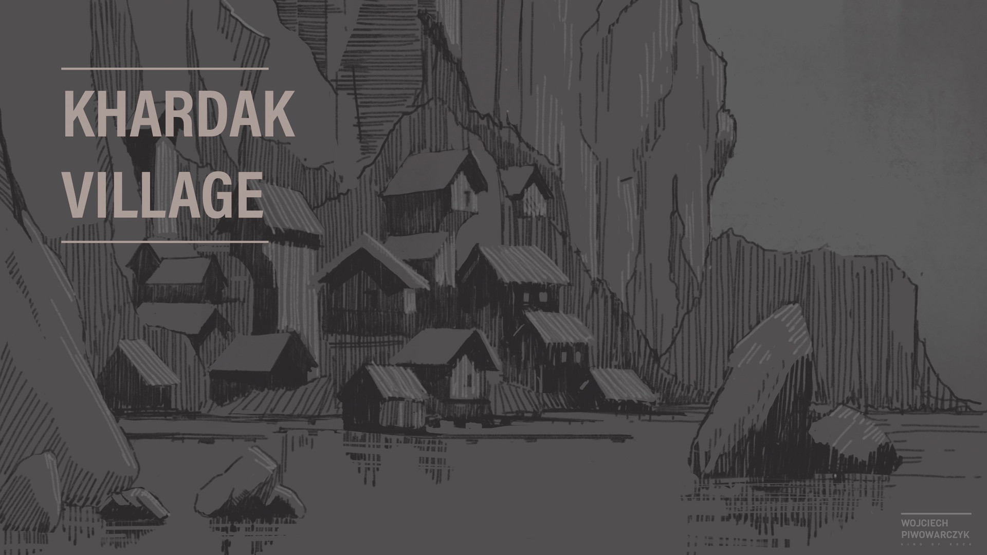
01 // Deciding on the setting and background story
I like to first focus on what is the setting and the background story of the environment I am about to make. In this case it's a small village that is set around an old ruin, that probably has some magical aura. Because of that influence, people live in prosperity and wealth. I really wanted to reflect that in the design of the dwellings, that's why I decided to go for more unusual proportions and really emphasize tall roofs. This subtle move adds a bit to the dignity and power rather than more flat and shot roof that represents more humble dwelling. Another reason to make the roofs taller is to fit another level inside of the building. Given the fact there is not much space for development between the cliff face and the water, it seems reasonable to build taller houses and make most of the limited space.
I think this kind of analysis is absolutely crucial. Even with a good brief from client and decent concept art it's still important to ground your work in the world your environment exists rather than just replicating concept image 1:1. As work progress things can change (sometimes a lot!) and things can quick fall apart if they were not built with understanding of the setting. As an environment artist one should consider her/himself an expert in the field with awareness of various settings and worlds that goes beyond what's in the concept.
After playing with proportions a bit, this was my result:
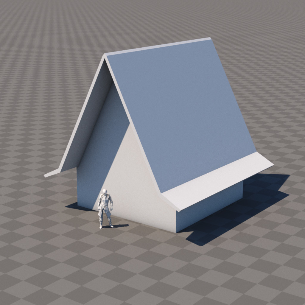
Now even though the result is a simple shape, there is a lot of figuring out of the proportions and balancing out different factors. Once again it's good to take one step further, go one level deeper and evaluate forms that you are working with. Even if this will not be seen in the final image, checking all the proportions goes a long way, that can save a lot of time in the future. Especially working with client it makes a huge difference. If something is not right and client can't point out why things are off, you will get a lot of rounds of unnecessary feedback.
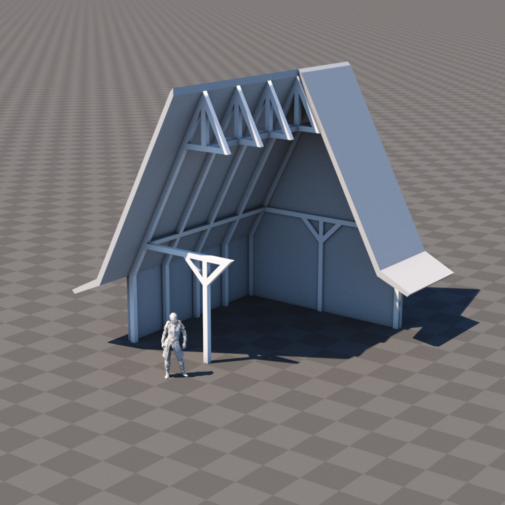
02 // Basic building block
Now, let's break down the design and start with the most basic module:

It's a cube! Yes, all 3D starts with a cube. This is 3x3x3m module I decided to start with. 3x3m grid is a good start for a medieval-ish wooden structure. This seems like a reasonable size based on available technology. It also scales well, if I put 4 of those together I get 6x6m floorplan, which gives me 36sqm area - that again seems like a perfect size for a small village dwelling. Now, 3m tall seems like a lot for medieval house ceiling height. Probaly 2.25m would be just enough, but I remembered I have to go higher to make the roofs look taller. So if I stack another layer of modules on top I get this:

Now let's see how thing are working out inside:
In this step I figured out how the internal structure would work. As I mentioned in previous section, there is a possibility of adding another level inside. This is how it could work out:
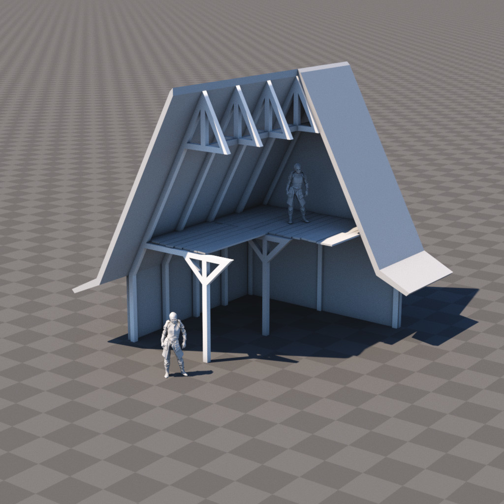
Now I feel I'm in a good position -I have my basic module figured out! Knowing this works, everything else that will follow is going to be much easier. Having the basic measurement in place I can use it to reference scale of everything else in the scene. Later I can check the dimensions and see if those align with real-world equivalents.
03 // Building the village
Next step was to use the basic module to create set of variations. I ended up with 10 modules. I didn't restrict myself to any set number of variations, I was just mixing them up until I ran out of ideas and they stopped to looking distinctive from each other:
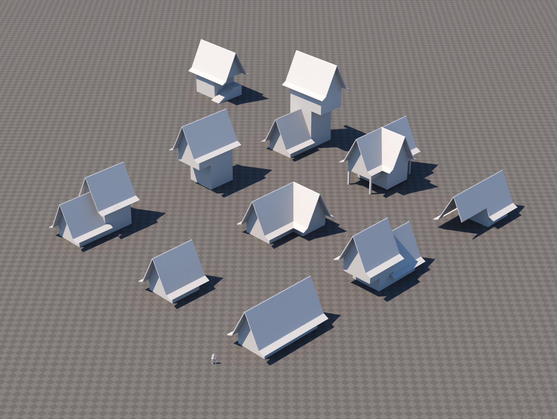
Ok, looks like I have everything I need to build the village, so let's do it!
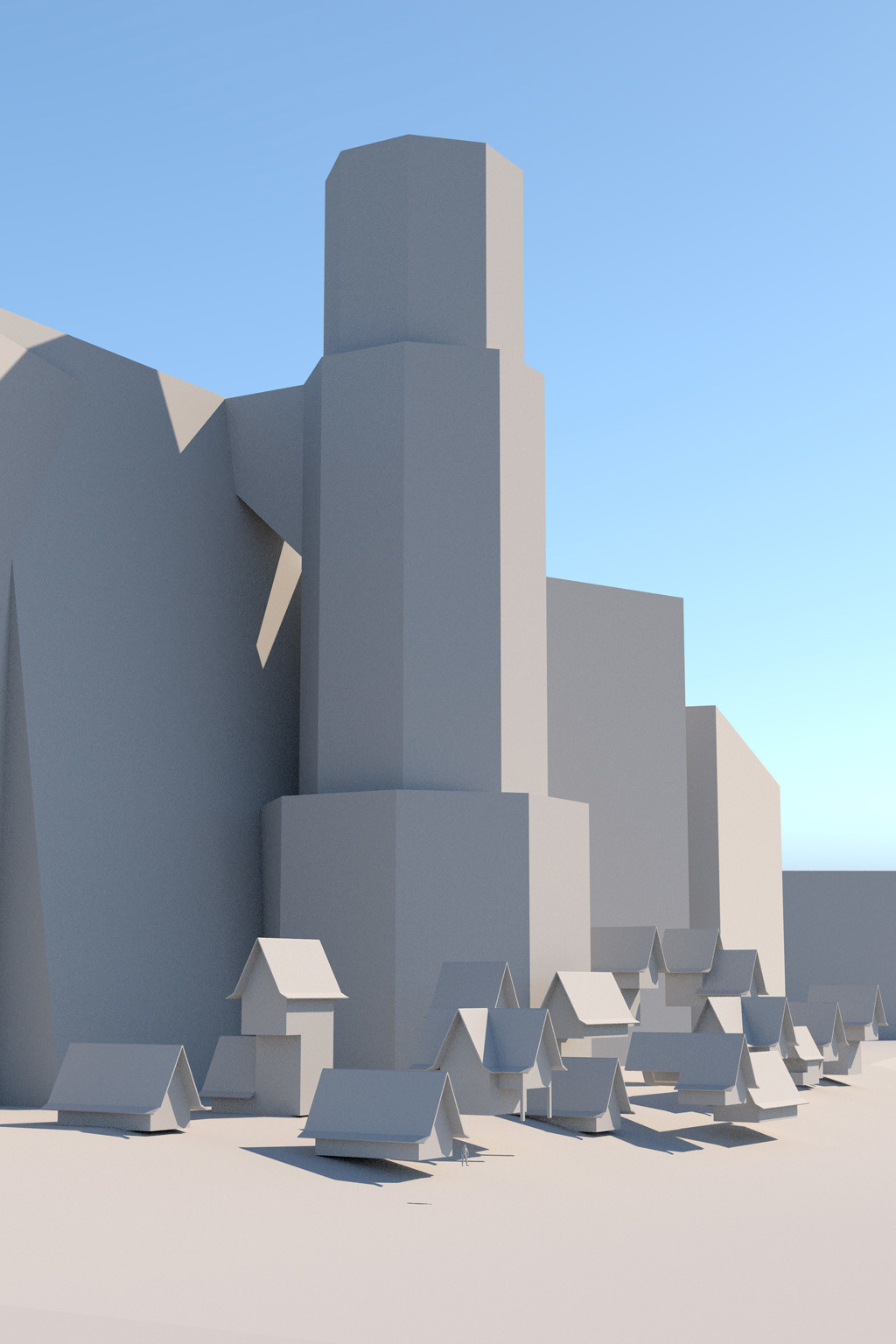
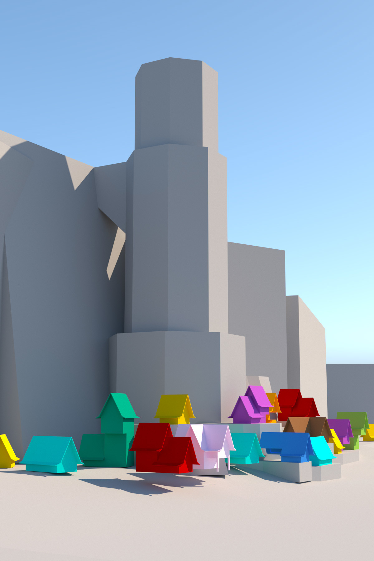
I placed the village houses around trying to get a similar look to the concept sketch. I used randomly all the variations trying to focus on the composition and arrangement first. Once I was happy with it I switched to top view and made sure the layout makes sense. I kept similar distance between buildings and lined them up around the shore to create clear coast line. I added quick blockout of the tower and cliffs. I knew I used some house variations multiple times, so I knew there could be a case of some obvious repetition. I did one more pass with color-coded houses, to see if there are any houses that are the same standing next to each other and made necessary adjustments:
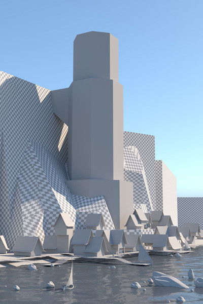
Ok, everything seem to be fine at this stage. Now all that is left it to tie the layout together, add water, and basic ground levels. Once the water was in the shot I felt like the bottom of the image is really empty, so I added some dressing elements in the foreground, and here is the final result:
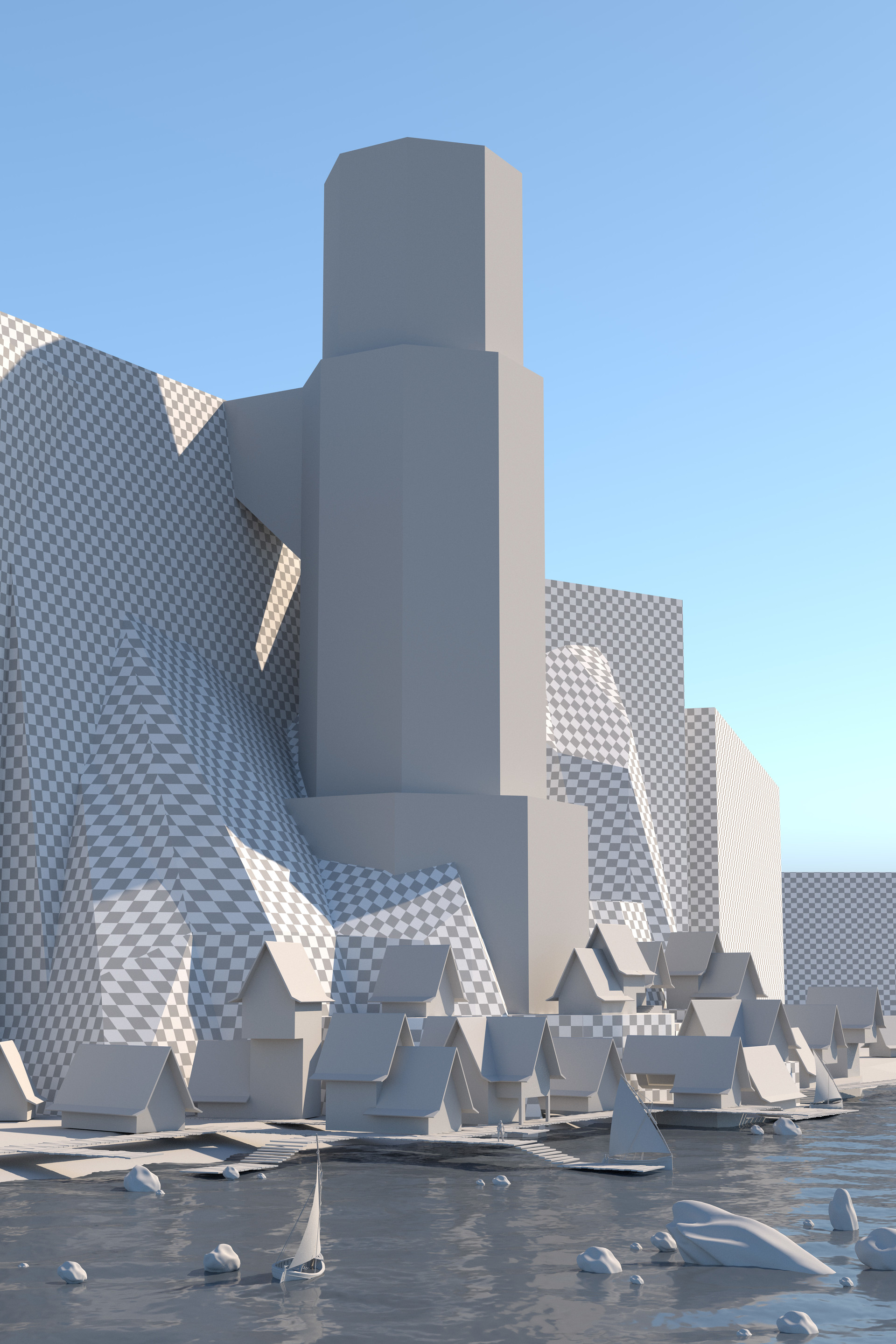
I added checker texture to the cliffs to get an idea how they work with perspective. Otherwise they looked like flat surface with no dimensions.
04 // Composition review and next steps
Ok, now it's time to review the progress. This step might not be significant, but it's super important. First of all I had to decide what would be the final resolution. In real-life scenario this would be an environment used for multiple shots, but in this case it's a single image, so to make it interesting, I decided to go for 4000x6000px. This should give me enough room to play with some nice detail. So first thing is to evaluate the final resolution in order to understand the scope of work.
This is 6000x4000px render viewed at 100%:

Next let's go the opposite direction and evaluate the image as a miniature, to see if the composition and layout clearly communicate the original idea from the sketch. Apart from just checking if the main forms are preserved, this way you can check how this image will look like for example an e-mail attachment. If you were to send this to client, this is what they will see before they open the file. You want to make sure it looks great even as a smaller version to get the recipients excited about your work and make them curious :) This the full image at smallest allowed resolution, 400x600px:
We are almost done. There is just one more step - ArtStation thumbnail! Yes, it is very important since this image is big, full of detail and not a square format, you want to make sure you can pull a thumbnail from it that will attack anyone browsing ArtStation. This is the one I picked:

That's it for this update! It's quite a lot of content, I hope you will find it useful! In next step will focus on set dressing and doing first pass on sculpting cliffs. Maybe I will be able to use something from Megescans library if I can find assets suitable for this environment.
Thanks for visiting!
Wojtek